


Animi — animated stories & video reels templates
Animi is a video editor where users can create stories and reels for instagram, videos for tiktok or slideshows using ready-to-use templates, animated text, graphics and music.
In this project I acted as a product designer, part manager, and was also involved in the creation of animated content. Since I was the only designer in the team, my tasks included: researching competitors (functional part and design solutions), communicating with users, designing the interface, designing visual part, creating the design system, prepare and describe design for the developers.
This is not a unique project on the market (the technology of animation creation is unique), so you can find enough competitors in the stores.
At the first stage I chose 5 main competitive applications that have more than 600 thousand downloads per month, and focused on studying their functionality. At this stage I was interested in the features that these apps provide to the user, while noting interesting ux solutions.
In the second stage, I studied user reviews in stores (despite the fact that Animi is developed only for iOS, I was also interested in reviews on Android). I was interested in reviews with ratings from 1 to 3, because there i can find great insights into what users are missing or dissatisfied with.
I was given the opportunity to talk to active users of competitive apps, so at the last stage of the research I prepared a mini-survey, and I had more than 20 hours of communication with the opportunity to find out the users "pain" of using these apps, as well as to find out what they like and what they miss.
Research
After analyzing the collected information, I started working on the prototype of the future app. Because the target audience is active users of instagram and tiktok, it was decided to follow their patterns and ux, so that it would be intuitive for users. We moved by sections: homepage plus all secondary pages, stories editor, reels editor, etc. For each of the sections I created a detailed* clickable prototype with real sizes of buttons/fonts/elements, creating a library of components in parallel.
We tested each prototype with users, I made a list of scenarios that I wanted to test and watched users in real time as they executed those scenarios, then we discussed different solutions and ideas. Since we talked to different users and sometimes got completely opposite comments, my job was to find a compromise that everyone (in some cases at least most of them) would like.
As a result of this step, we got a finished prototype of the whole application, which was verified and approved by users, plus most of the components that could be quickly and easily customized to get the final design.
Prototype
Testing
Testing
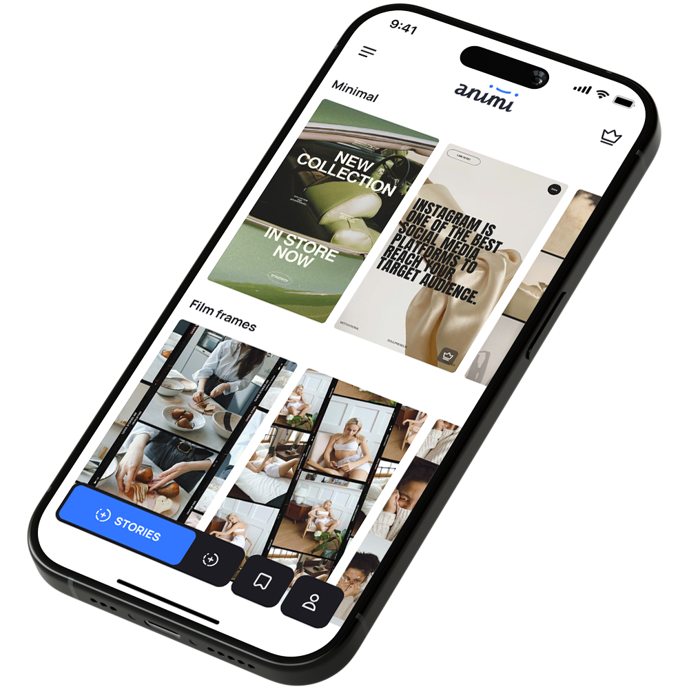
As I have already mention above, our target audience is active users of Instagram and Tiktok, so we decided not to experiment with the visual part and try to make the interface intuitive, pleasant, while not making a complete copy of social networks and competitors.The final design was also undergoing testing by users.
DESIGN
* I follow this approach, because detailed prototypes are more convenient to test on users, time spent on such work is more only by 10-15% at most than on the creation of prototypes of small detail, and later it is much easier to bring them to the final design
Together with the manager we prepared events and their descriptions, as well as made a plan for testing and determined which indicators we were interested in.
AMPLITUDE
🤷🏻♂️
To see my works
please open website from desktop.
please open website from desktop.
